Developers who finally land a job doing what they love — coding — frequently face a brain-teaser: Coding for a living is fantastic, indeed, but is it as endearing when you’re stuck doing the same task over and over again? Because, we get it: writing CSS is allegedly fun, but try doing it on repeat.
Fortunately, web developers constantly drop tools and frameworks that make day-to-day tasks feel like less of a headache. One toolkit that has gained significant attention recently is Tailwind CSS.
Its approach to building user interfaces promotes a utility-first CSS framework that allows you to easily style your websites without the need to write custom CSS code. This open-source GitHub favourite provides a set of pre-built utility classes that you can apply directly in your HTML code to achieve different styles and layouts within any design. Sounds promising if you want to stop asking yourself if you loved to code in the first place.
But, is it worth trying in 2023? Let's dive into the details and explore its features, benefits, downsides, and how it’s still valid for developers today.
What is Tailwind CSS?
Tailwind CSS is a utility-first CSS framework that provides a comprehensive set of pre-built classes to speed up the development process. Unlike traditional CSS frameworks that come with pre-designed components and styles, Tailwind CSS focuses on supplying small, single-purpose utility classes that can be combined to create custom styles, providing more flexibility and control over the appearance of a website. Web designers online have called it a lean, utility-based CSS framework intended for speedy UI development.
The team behind Tailwind CSS is still adding features, and recently launched its Just-In-Time (JIT) compiler to get lightning-quick build times. This means the toolkit is a time saver on two fronts: it’ll save your time and the person-behind-the screen’s time (without testing their patience).
Developers can compose these classes to create components and layouts. For example, you can define text colour, background colour, padding, margin, and more by simply adding classes to your HTML elements. This modular approach makes it easy to tweak and scale your designs without writing custom and repetitive CSS (contrary to Bootstrap, which aims to provide a familiar and consistent look and feel across different projects).
Who's using Tailwind CSS in 2023? What is it great for?
Even if certain YouTube channels have recently dunked on this framework for being too contrived, Tailwind CSS is anything but a fad. In 2023, these organisations use Tailwind CSS for their sites:
OpenAI and ChatGPT (hope they secured royalties here)
MrBeast’s Feastables microsite
Microsoft .NET’s marketing site (kind of amusing)
Moreover, according to industry insights, more than 400 companies, some of them even more tech-oriented than the list above, are using Tailwind CSS. The adoption by a number of different companies suggests two things: First, the framework can cater to diverse needs, from media sites to e-commerce platforms. Second, its adoption by such industry heavyweights indicates a level of precision that might not be beginner-friendly. From a frontend perspective, the fact that OpenAI is using it underscores how versatile and respected Tailwind CSS is in 2023, but also hints at a steeper learning curve.
The fact that this toolkit is meant for mid-level developers is already evident. However, due to its diverse acceptance, it can be challenging to pinpoint the specific application of Tailwind. Is it specifically good for e-commerce? Or for marketing sites? It’s not obvious, since it seems like a versatile instrument. That’s a good thing.
Integrations
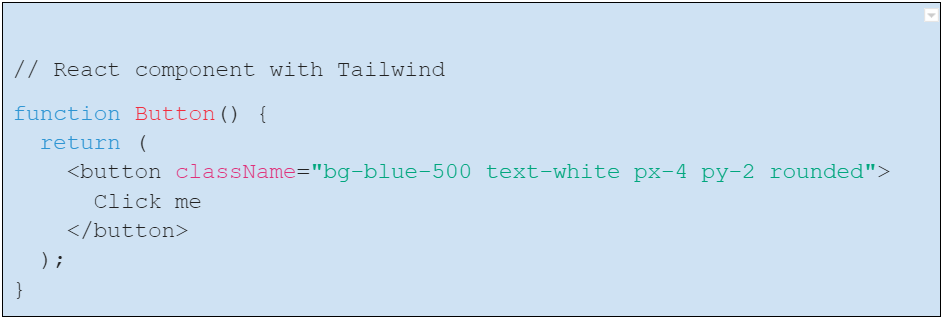
Tailwind CSS integrates seamlessly with various frontend frameworks and tools. It pairs well with popular JavaScript frameworks like React, Vue.js, and Angular. Additionally, Tailwind CSS can be easily integrated into build tools like Webpack and PostCSS, ensuring a sleek development workflow and leaner sites. The following React code snippet should render a blue button with white text when included into a React app that, well, also has a Tailwind CSS set up.

Advantages of Tailwind CSS in 2023
Tailwind CSS offers several benefits that make it a compelling choice for developers in 2023:
Responsive design: Firstly, it provides a highly customisable approach through the tailwind.config.js file, allowing developers to define colours, breakpoints, fonts, and much more.
Consistency: With its unified design system, Tailwind ensures the overall frontend consistency across all pages and maintains a cohesive design.
Speedy development: One of the standout advantages of Tailwind CSS is its ability to accelerate development. By leveraging pre-defined utility classes, developers can build UI components quickly without the need for custom CSS (we’d love to know how long it took you to build a site with Tailwind).
The Tailwind UI repo: Tailwind UI is a collection of professionally designed, pre-built, and fully responsive HTML snippets that can be used in Tailwind CSS projects, It’s run by the same team behind Tailwind CSS and provides a wide range of UI components, templates, and examples that developers can use as a starting point for their web development projects. Tailwind UI aims to help developers build fine-looking and functional user interfaces without writing repetitive code.
The JIT mode: The JIT mode is a compiler that generates CSS styles on-demand as you author your templates, rather than generating all the classes in advance at initial build-time. In JIT mode, Tailwind analyses your HTML templates and generates only the necessary CSS styles based on the classes used in your markup — providing faster build times.

Downsides of Tailwind CSS in 2023
While Tailwind CSS brings numerous advantages to the table, it has received some criticism as well:
Learning curve: For developers new to Tailwind CSS, there can be a long learning curve as they become accustomed to the utility class-based approach. This might slow down initial development until familiarity is achieved.
‘Limited design creativity’: While Tailwind CSS offers flexibility, especially compared to other popular frameworks like Bootstrap, some designers and developers may find it constraining for highly creative or unconventional designs. I’ll admit that this point is a bit nuanced. While Tailwind is utility-first, it doesn't really limit design creativity. It's flexible enough to let developers build almost anything. However, the challenge might be thinking within utility class constraints. It's more about adjusting to a new mindset than an actual limitation in creative design.
Large file sizes: Tailwind CSS can generate large CSS files, which might impact page load times. Careful optimisation and tree shaking are both necessary to mitigate this issue. Still, its integration with PurgeCSS can help developers obtain smaller and quicker files.
It's worth noting that with the advent of the JIT mode, the development builds are much leaner because only the used classes are generated on-the-fly.
Hey, Tailwind CSS enthusiasts — did you know JavaScript is the most in-demand tech in Germany? Read our 2023 Developer Salary Report and uncover more insights like this one.
Still, many of these benefits and downsides are just relative. That’s why we suggest comparing Tailwind CSS against other projects, such as the world-famous Bootstrap.
Tailwind CSS vs. Bootstrap: How does it hold up?
When developers consider a new styling tool, Bootstrap typically serves as the gold standard for comparison. A component-based framework, Bootstrap ships with ready-to-use components like modals, buttons, and navbars. It's the ‘grab-and-go’ of the CSS world, prioritising speed and a unified look. In 2023, you can tell when a site is using Bootstrap's glossy icons right away.
Tailwind, on the other hand, adopts a utility-first approach. Instead of pre-designed components, you get atomic utility classes. The idea? Craft your UI piece by piece, granting designers and developers more flexibility. So, if in Bootstrap, a button might be determined as <button class="btn btn-primary">Bootstrap</button>, in Tailwind, it’ll be:

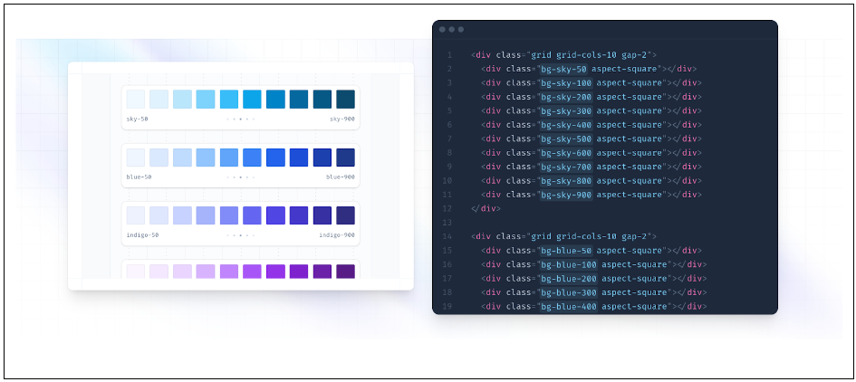
This brings the matter of customisation. While Bootstrap is customiszable using SCSS variables, deviating significantly from its default look demands overriding styles, sometimes leading to ‘Bootstrap fatigue’ where every site seems eerily similar. Customisation, on the other hand, is Tailwind's playground. The tailwind.config.js file is your canvas, allowing bespoke designs. Do you want a specific shade of blue or a unique breakpoint? Devs can define it very easily. So head to your palette-picking sites and get on with it.

Bootstrap, with its well-documented, component-based nature, often serves as the first port of call for budding CSS enthusiasts. Its off-the-shelf components, like responsive navbars, mean rapid development. However, this convenience sometimes contributes to project bloat, affecting performance.
In contrast, Tailwind CSS is akin to crafting with precision tools. Instead of pre-styled components, you're presented with granular utility classes. For example, with Bootstrap, you might use a single class for a button, whereas in Tailwind, you would meticulously define its appearance with a combination of utilities, like text colour, background, and padding. It's a system that might seem overwhelming to novices, but offers seasoned frontend developers an unparalleled level of control. Furthermore, Tailwind's integration with PurgeCSS helps remove unused CSS for an economical, prompt build.
Essentially, while Bootstrap is geared toward quick, uniform designs, Tailwind is great for seasoned developers seeking accuracy in their designs. Both are legitimate choices in 2023.
Content for your skill and soul:
A real use case for Tailwind CSS in 2023
Thanks to the testimony of a frontend expert, we can go over a use case where Tailwind CSS helped the most relatable of online businesses: a SaaS. While building NodCards, a digital business card platform, the developer came across a challenge: allowing users to dynamically select any primary design colour for their cards. This choice had to be incorporated without altering the website's markup or stylesheet.
Tailwind CSS, in combination with its JIT compiler (head to Tailwind’s official site to learn how to enable it), presented the dev with a workaround. However, the dynamic colour application wasn't straightforward. Instead of relying solely on Tailwind's utility classes, the developer utilised the power of CSS variables and helper functions.

This helper function converts a HEX colour to RGB, which aids in creating CSS variables for the dynamic primary colour. Once converted, these RGB values are integrated with Tailwind CSS to produce varied shades, ensuring flexibility with opacity layering. For instance, the text colour for a user's name can be dynamically set:

Similarly, buttons can be styled to use the primary colour with variable opacities and even adjust for accessibility concerns on hover:

With Tailwind CSS, NodCards managed to offer users the flexibility to personalise their cards' design dynamically, while ensuring aesthetics, accessibility, and a nimble site.
So, in conclusion
As seen through the lens of high-profile sites and real-world use cases, it's clear that Tailwind CSS is more than just a passing trend. If you're on the fence about adopting it, remember that aptitude often begins with experimentation. So, dive in, get your hands dirty with Tailwind, and let your creations speak for themselves.
While it may require some initial investment in learning, the benefits it brings in terms of productivity, scalability, and performance might make it worth the while. And if you checked out our salary reports from 2023, you’ll have noticed that demand for frontend developers keeps growing. So, how about you add a new toolkit to your brimming résumé and even share your observations with us? Moreover, why not read our latest tips, tricks, and trends by subscribing to the .cult newsletter?


